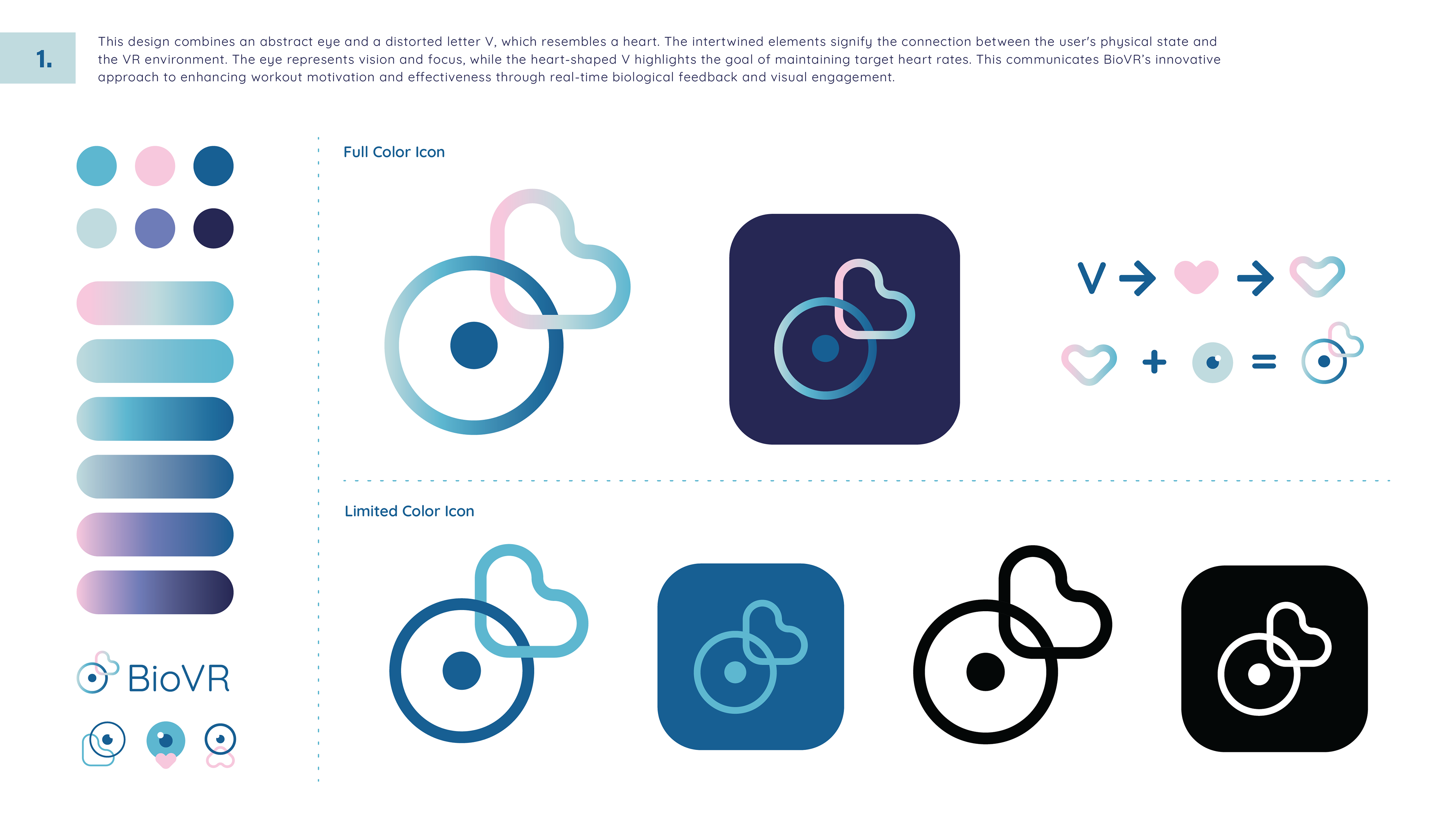
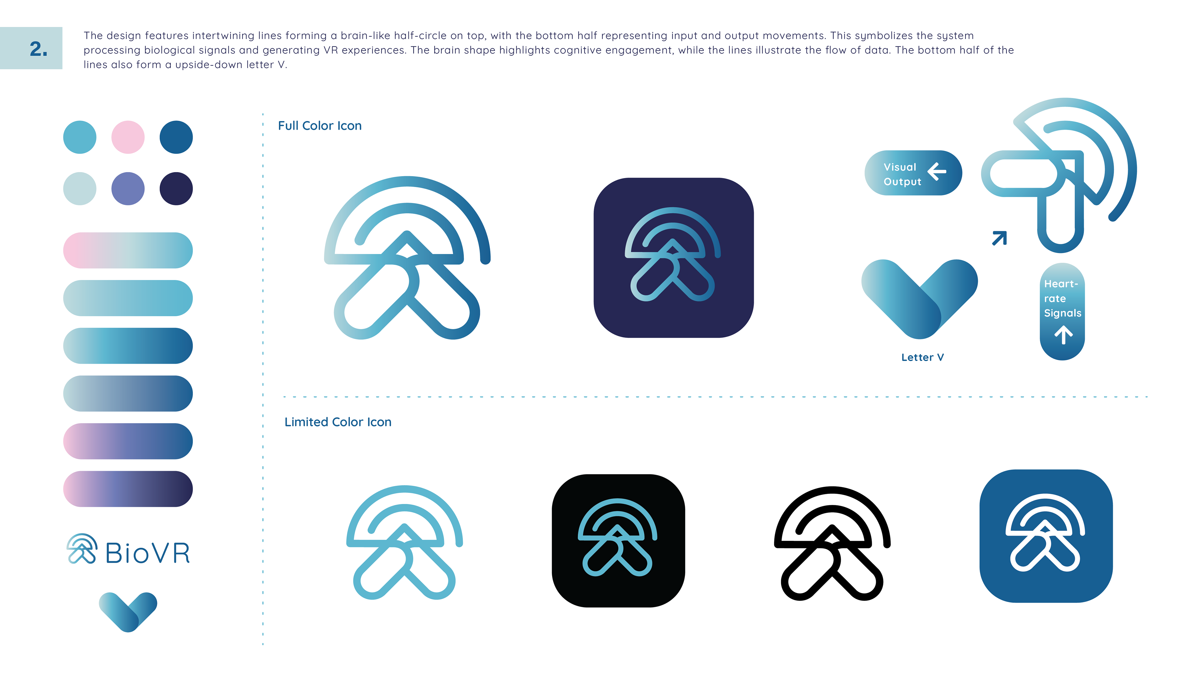
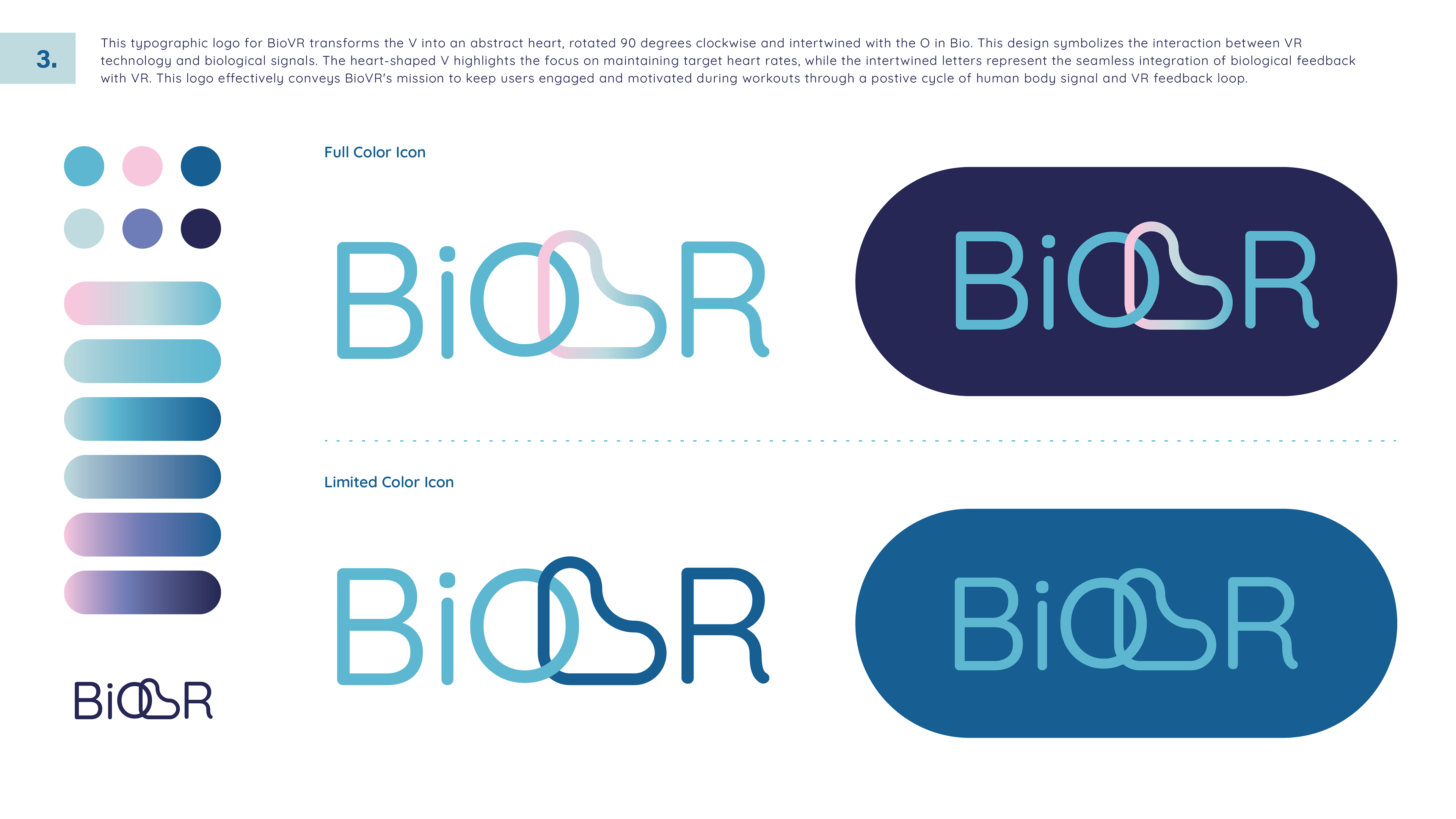
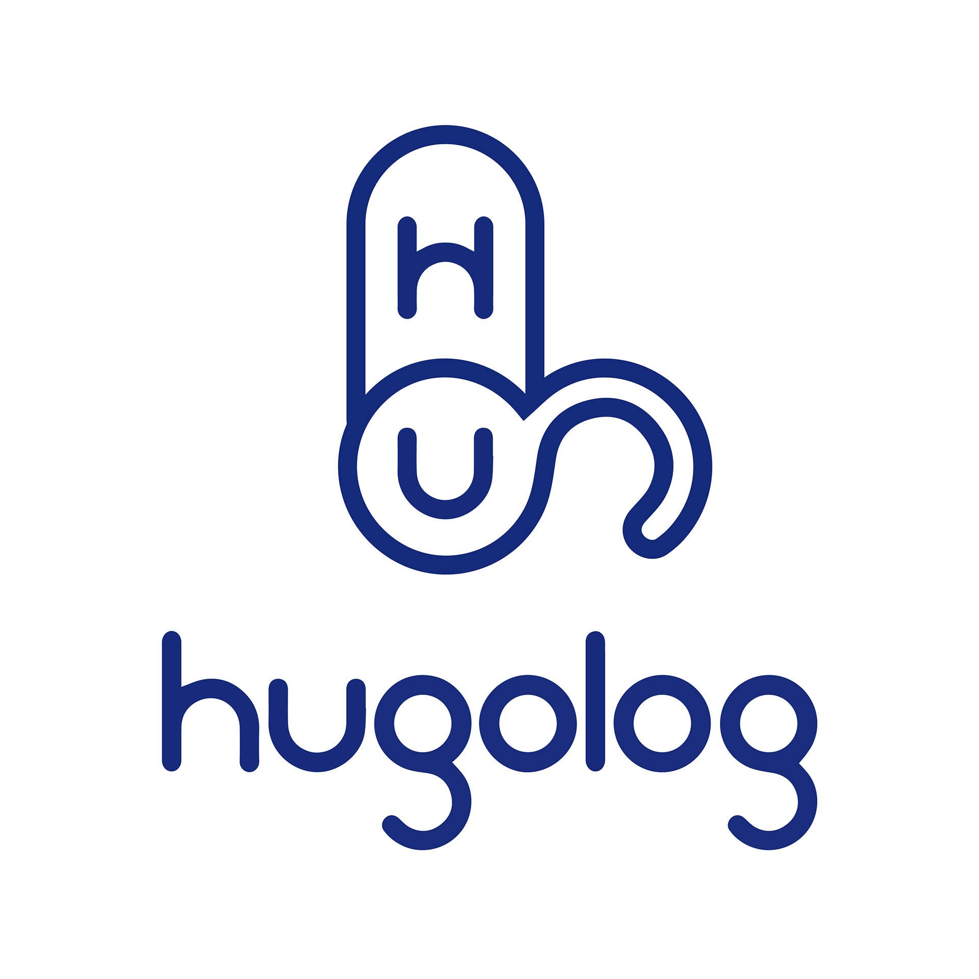
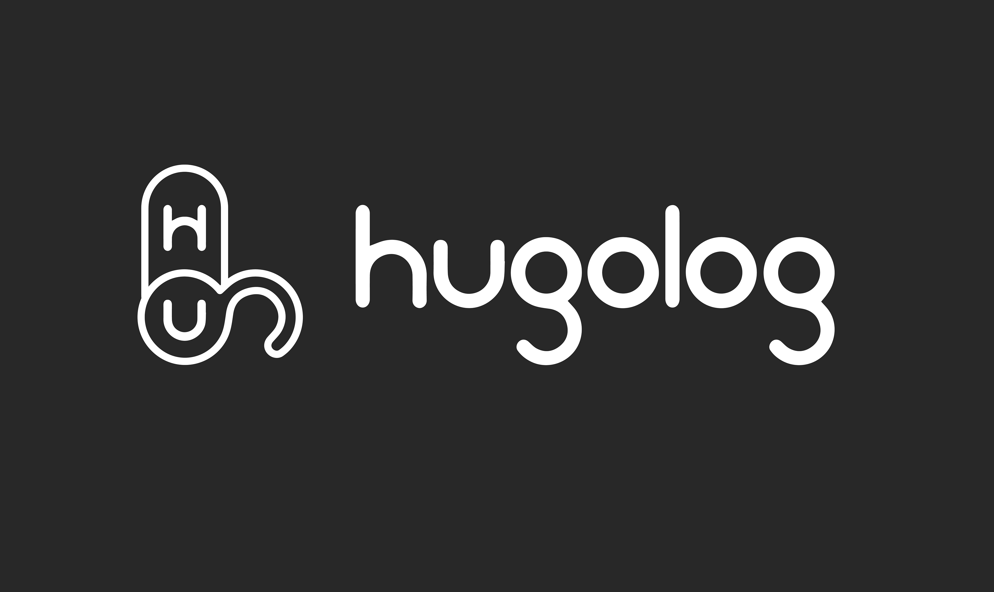
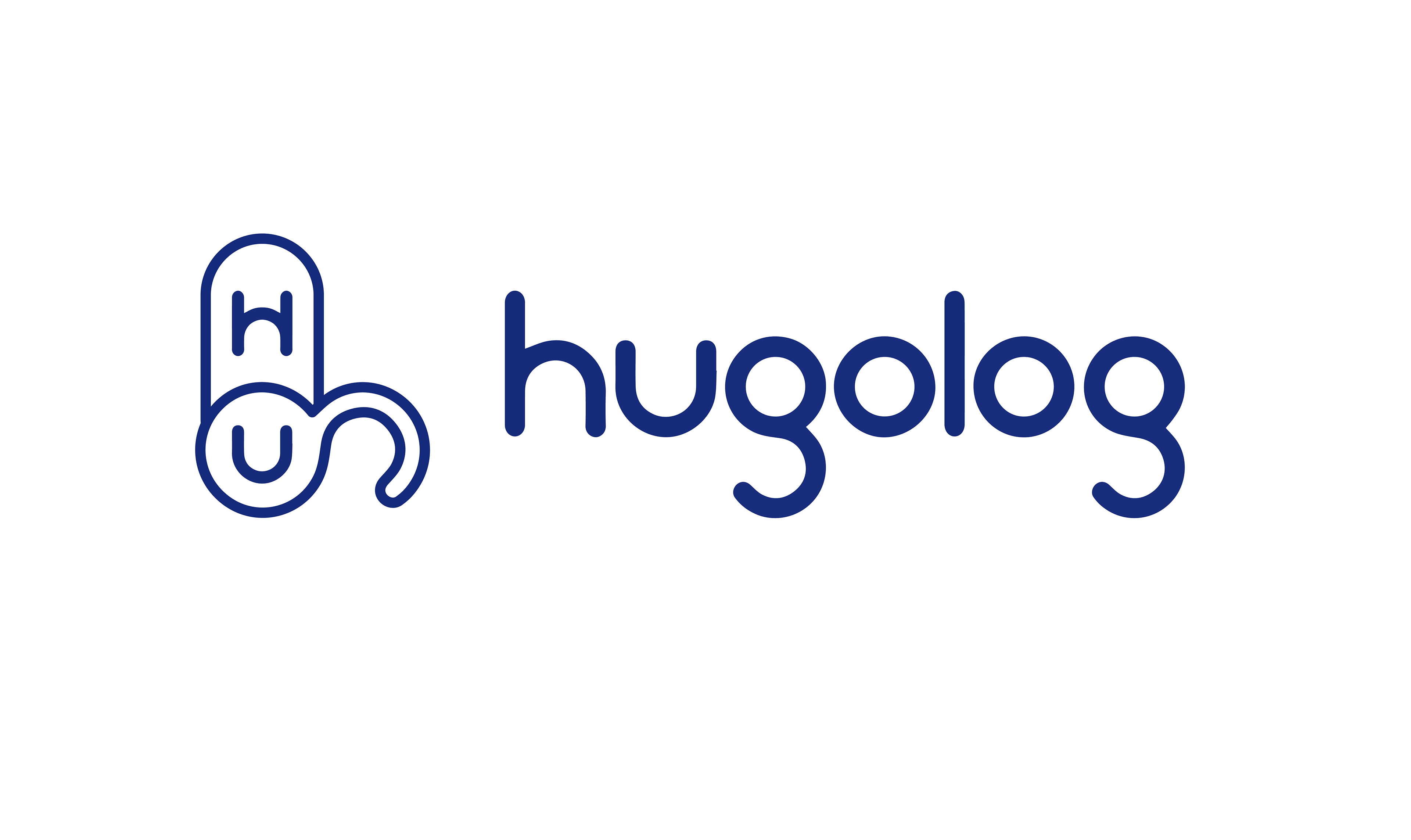
BioVR Logo Design

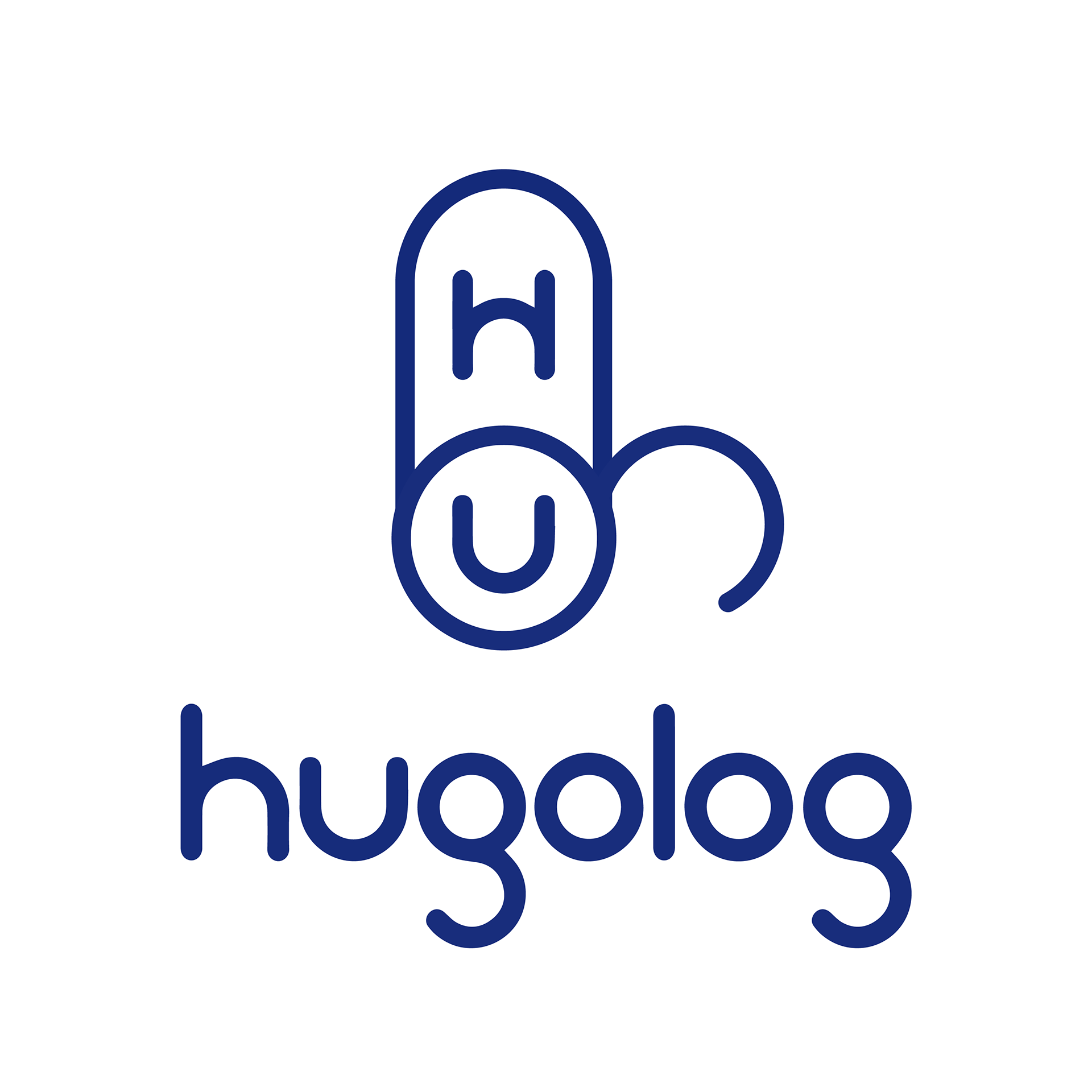
Hugolock logo & Mascot
Project Background
Hugolog is a new brand in the smart lock – consumer electronics industry. Competing against big brands like August, Hugolog is seeking way to establish brand recognition and credibility in consumers, and eventually grow market share steadily.
Challenge
Although customers’ interest in smart home products are high and increasing, Hugolog is a newcomer in the smart home industry and doesn’t have a large customer base or brand awareness. Brands like August have more experience in marketing products and features to the consumers.
Goals
Differentiate Hugolog brand identity from its competitors. Connect with potential customers emotionally and intellectually by providing value (smart life knowledge) first. Advocate a life-style, more than promoting products. This requires a more humane touch to Hugolog brand messaging and appearance.
Introducing Hugo, your smart life coach.
Initial concepts
- 3 Directions
Yellow, blue and green, each represents one most prominent personality.
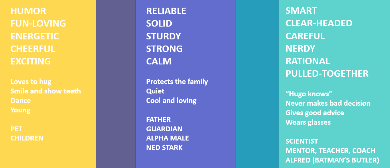
I summarize some key qualities and personalities that our brand stands for. For each direction I create a design of HUGO.

Design Concepts
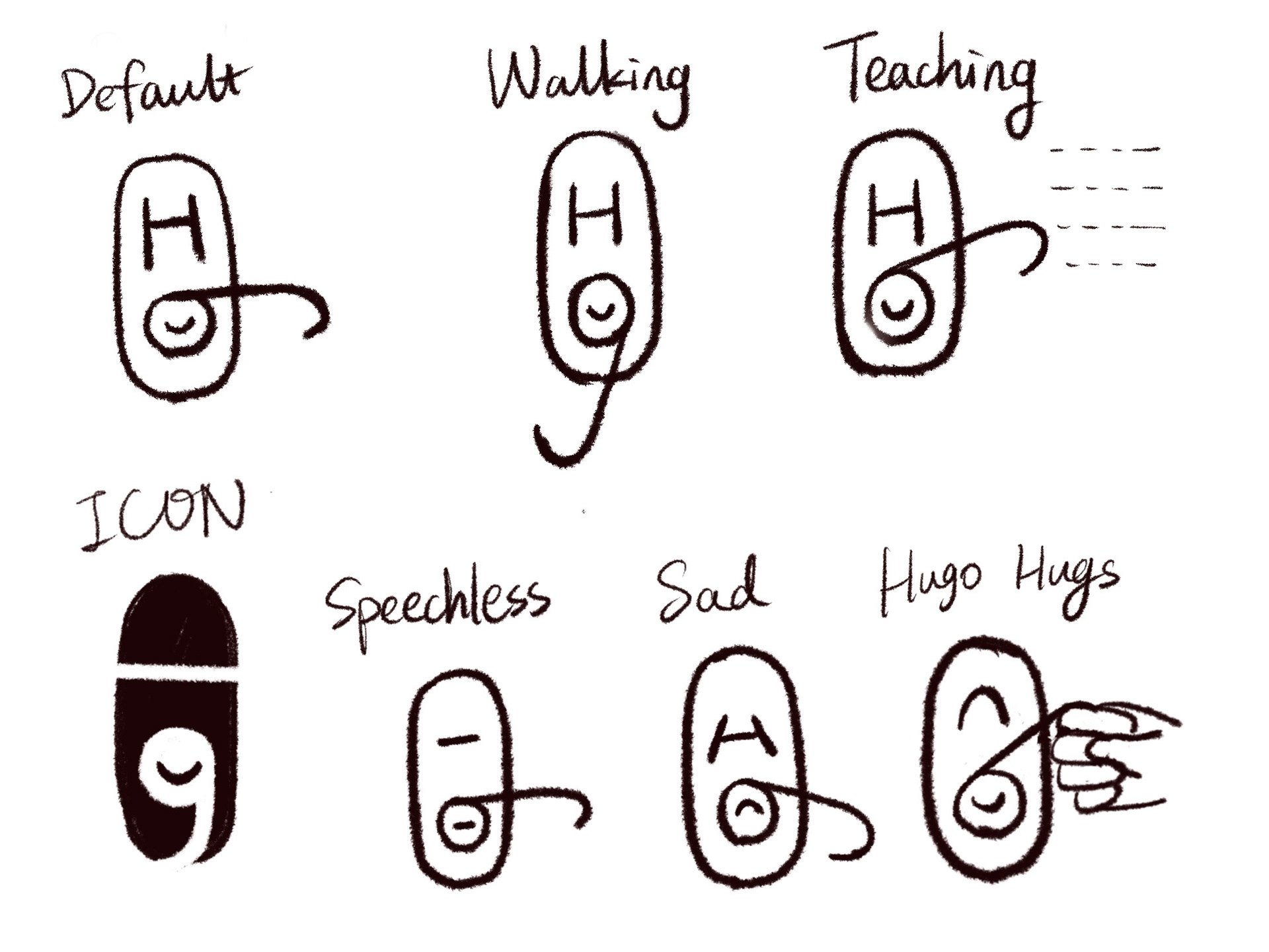
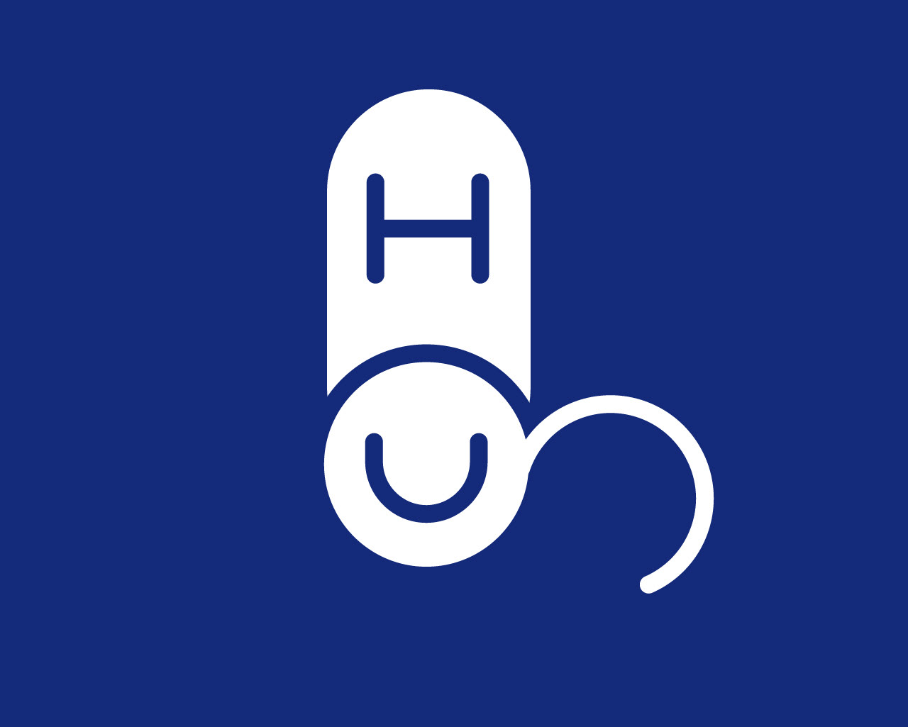
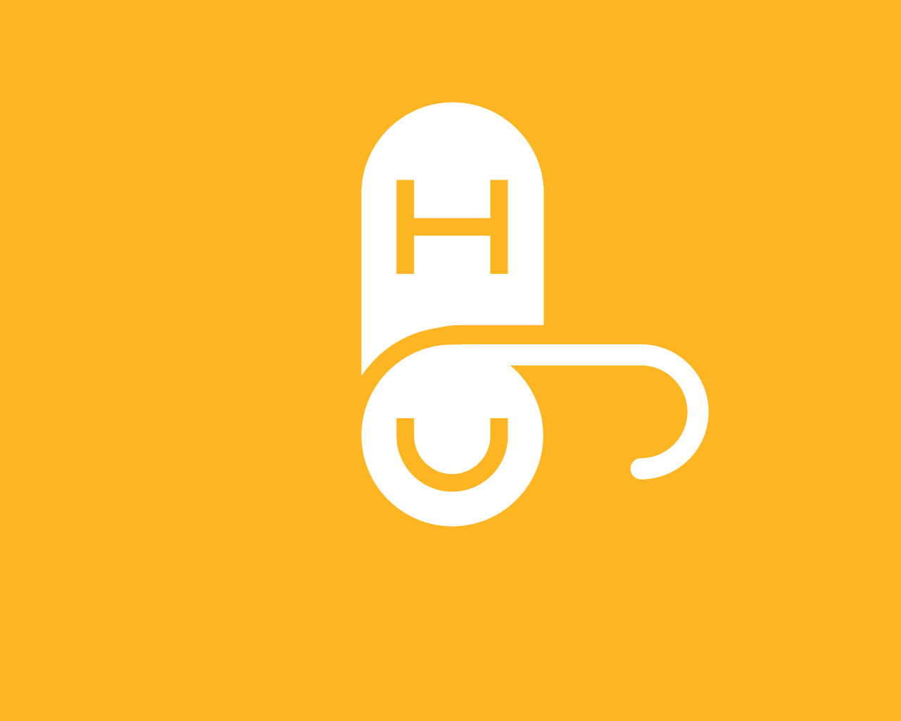
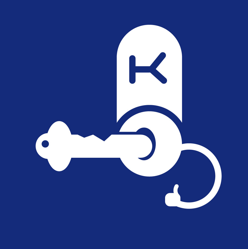
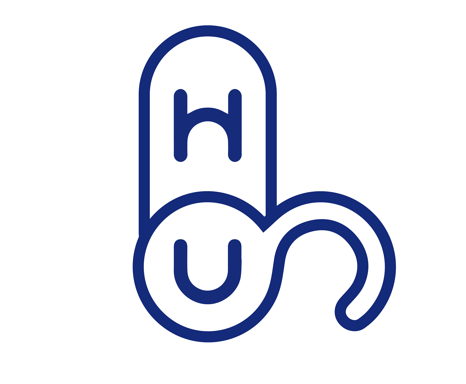
The fun-loving character was built mainly using rounded shapes and curvy lines. It is composited with the letter H, U, O and G of the character name. Its appearance resemblances the featured smart lock products of Hugolog.

Design Concepts
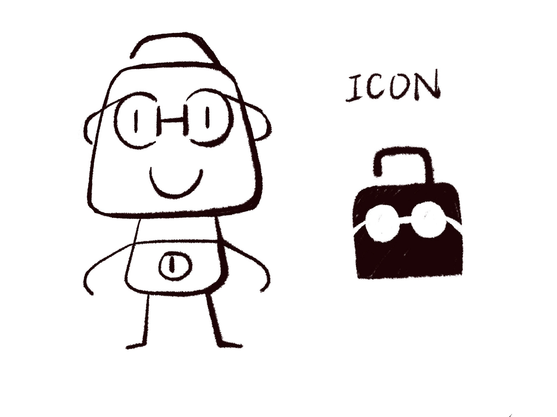
The calm, scholarly and teacher-like personality. This character features a pair of glass which represents intelligence. Its head is an open traditional lock.
Design Concepts
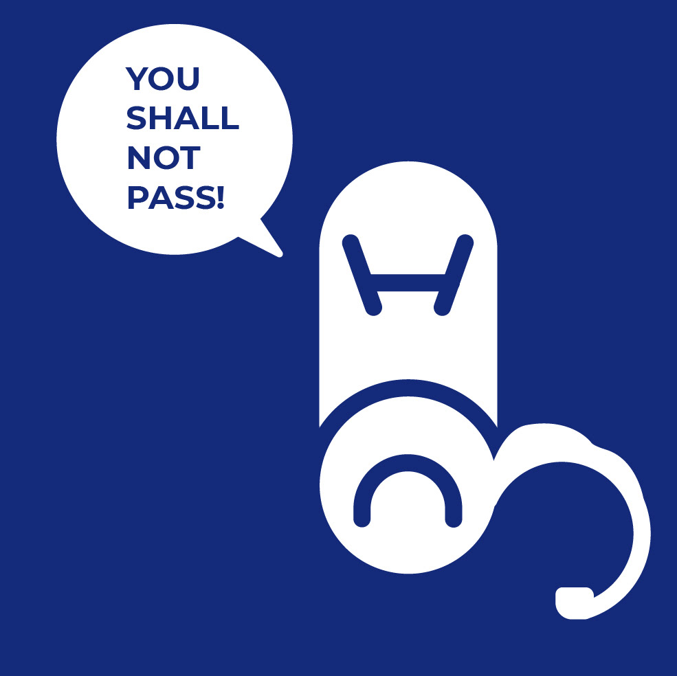
This design follows the "blue" direction, the masculine guardian and protector of homes.
It has a more angular shape than the two designs above. A key hole on his broad chest, and his head consist of the distorted letters H, G and U. It's huge nose and confident smile delivers a reliable, confident feelings to the viewers.
It's icon resemblances one of Hugolog's smart lock products.
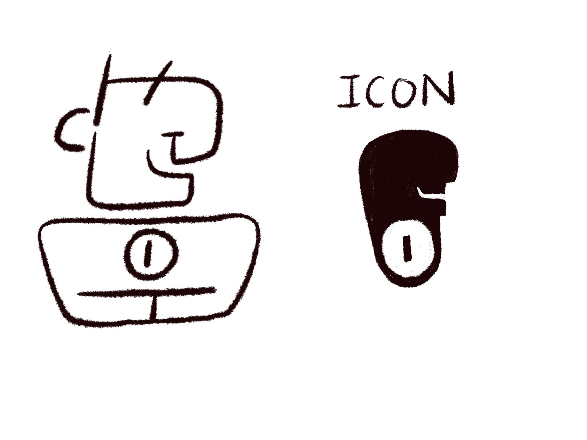
Illustration Exploration
2nd Draft
1st Draft
FINal concepts

We decided to go from the first direction. We try to make the character has more similarities with the brand logo, so the letter "g" was modified to look similar to the "g" in the logo above. The cap stroke of the initial concept is replaced with rounded stroke.
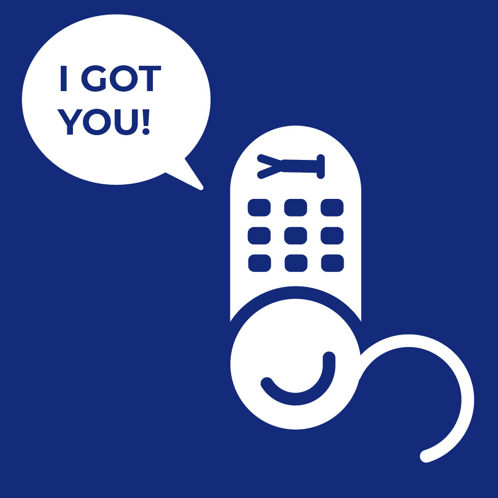
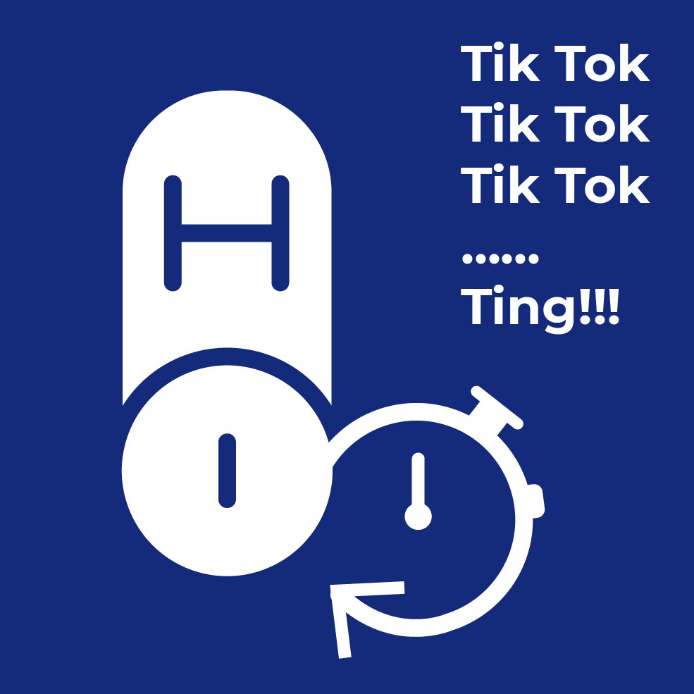
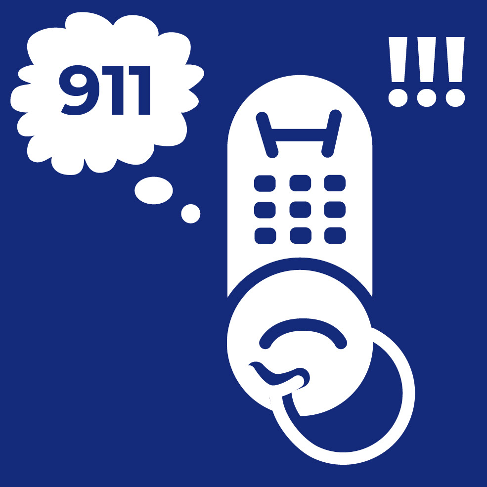
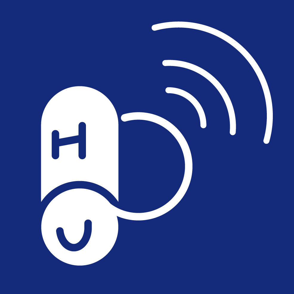
SECONDARY ILLUSTRATIONS